一.场景
需要实现时间轴列表,左边一串小圆点,右边是列表内容,需要小圆点位置与列表项对应,最终效果如下:
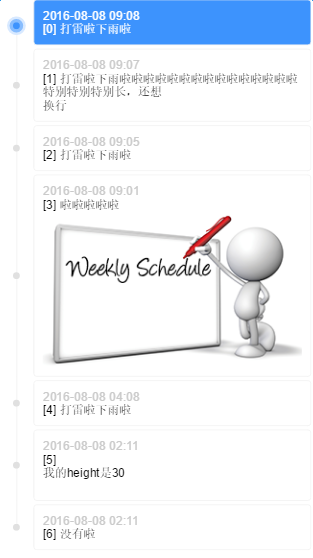
timeline
二.实现方案
有几个细节:
小圆点要与列表项对齐
首项、末项的时间线不能超出小圆点
列表项之间要有间隔
前两条是对自适应的要求,最后一条是对布局的限制
传统方案是通过列表容器生成一条足够长的竖线,然后列表项自带小圆点,再把小圆点对齐到竖线上。竖线的长度没有办法精确控制(不通过js计算的话),无法满足第二条,那么可以换个方式,让列表项自带同高度的竖线,拼接成完整的时间线
P.S.不用担心拼接出来的竖线会被看出来,一定是完美无缝的,否则浏览器不科学(两个相邻的块级元素之间不能有无法解释的缝隙吧,那么它们的border-left一定能够完美连接起来)
三.具体实现
首先确定结构,因为列表项间隔的限制,列表项需要多套一层:
.listItem>.listItemContent>.listItemContent-date+.listItemContent-content
因为用margin实现间隔的话竖线长度不对,接不起来,所以多套一层listItem,把margin换成padding。由listItem携带竖线和小圆点:
/* 列表项间隔padding-top */
.listItem {
    position: relative;
    padding-left: 40px;
    padding-top: 4px;
}
/* 列表项自带竖线 */
.listItem:before {
    content: "";
    display: inline-block;
    position: absolute;
    top: 0;
    left: 0;
    width: 1px;
    height: 100%;
    border-right: 1px solid #f3f3f3;
    left: 19px;
    z-index: 1;
}
/* 列表项自带小圆点 */
.listItem:after {
    content: "";
    display: inline-block;
    position: absolute;
    width: 8px;
    height: 8px;
    background-color: #e0e0e0;
    border-radius: 4px;
    left: 16px;
    top: 50%;
    margin-top: -2px;
    z-index: 1;
}
注意小圆点的margin-top,这个-2px不是目测的,与列表项间隔和小圆点高度有关:
// top 50%, marginTop -50%是小圆点相对于listItem竖直居中
h = listItemContent.height
pt = listItem.paddingTop
ch = 小圆点.height
y = (h + pt)/2 - ch/2
// 我们想要小圆点相对于listItemContent竖直居中
// 要去掉pt带来的向下偏移offsetY = pt/2 所以
top 50%, marginTop -ch/2 + offsetY
top 50%, marginTop -4 + 2
top 50%, marginTop -2
这是margin转padding套一层带来的麻烦
然后加上首项、末项的时间线不能超出小圆点的限制:
.listItem-first:before {
    height: 50%;
    top: 50%;
}
.listItem-last:before {
    height: 50%;
}
最后添上高亮的效果:
/* 高亮小圆点 */
.listItem.highlight:after {
    -webkit-box-sizing: border-box;
    -moz-box-sizing: border-box;
    box-sizing: border-box;
    width: 16px;
    height: 16px;
    background-color: #3d93fd;
    border: 4px solid #88bdfe;
    border-radius: 8px;
    left: 12px;
    -webkit-box-shadow: 0 0 0 3px #d8e9ff;
    box-shadow: 0 0 0 3px #d8e9ff;
    z-index: 2;
}
/* 高亮列表项 */
.listItem.highlight > .listItemContent {
    background-color: #3d93fd;
    color: #fff;
}
/* 高亮列表项内容 */
.listItem.highlight .listItemContent-date{
    color: #fff;
}
四.Demo
在线Demo:http://www.ayqy.net/temp/timeline/index.html
点击列表项高亮,列表项内容支持HTML和图片自适应
写在最后
最近在啃JS动画原理,感谢月影前辈的分享,功力深厚
之前看过几遍了,一直没有理解透彻,直到自己实现才发现数学公式与easing算子的关系
强烈推荐:关于动画,你需要知道的
文章格式很舒服,内容思路也很清晰。