一.语法
transition用来定义元素两种状态之间的过渡,比如a标签的lvha四种状态,或者用js手动切自定义状态,有4个子属性:
transition-property 默认all
transition-duration 默认0s
transition-timing-function 默认ease
transition-delay 默认0s
简写语法:
transition: 属性名 过渡时间 缓动函数 延迟时间, 下一组
前两个必填,后两个可选,延迟时间在过渡时间之后,逗号分隔可以填下一组
二.transition-timing-function
可选值如下:
transition-timing-function: ease | linear | ease-in | ease-out | ease-in-out |
    step-start | step-end | steps( <integer> [, [ start | end ] ]? ) |
    cubic-bezier( <number>, <number>, <number>, <number> )
分为两类:
平滑过渡(easing系列,
ease等关键字和cubic-bezier()自定义贝塞尔曲线)一步一顿过渡(step系列,
step-start、step-end及steps())
easing系列
ease等关键字
ease
The ease function is equivalent to cubic-bezier(0.25, 0.1, 0.25, 1.0).
先很快后慢
linear
The linear function is equivalent to cubic-bezier(0.0, 0.0, 1.0, 1.0).
ease-in
先慢后快
The ease-in function is equivalent to cubic-bezier(0.42, 0, 1.0, 1.0).
ease-out
先快后慢
The ease-out function is equivalent to cubic-bezier(0, 0, 0.58, 1.0).
ease-in-out
中间快,两头慢
The ease-in-out function is equivalent to cubic-bezier(0.42, 0, 0.58, 1.0)
自定义3阶贝塞尔曲线:
cubic-bezier(<number>, <number>, <number>, <number>)
3阶贝塞尔曲线,4个参数是2个控制点的横纵坐标,例如ease
P.S.确定一条3阶贝塞尔曲线需要起点、终点及2个控制点的坐标,CSS里默认起点(0, 0),终点(1, 1),所以只需要2个控制点的坐标
step系列
step系列都没有平滑过渡效果,step表示一步一步做,也就是一步一停顿,看起来的效果是一卡一卡的,多用于逐帧动画
steps
Specifies a stepping function, described above, taking two parameters. The first parameter specifies the number of intervals in the function. It must be a positive integer (greater than 0). The second parameter, which is optional, is either the value ‘start’ or ‘end’, and specifies the point at which the change of values occur within the interval. If the second parameter is omitted, it is given the value ‘end’.
(引自CSS Transitions)
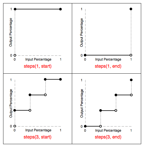
steps(正整数[, start | end])
正整数表示间隔数,从初态到终态分几步完成
第二个参数可选,表示在每个间隔的起点还是终点发生变化,默认是
endstep-start
等价于
steps(1, start)step-end
等价于
steps(1)或steps(1, end)
如下图,其中空心圆到实心圆表示发生变化:
step
具体差异见Demo:http://www.ayqy.net/temp/transition-steps.html,点击红色块开始transition
三.注意事项
1.属性值不要为auto
属性值不要从auto开始或者变到auto,因为不同浏览器不同版本效果可能不一样
2.对新增的DOM元素延迟应用过渡
不要在添加DOM元素,或者去掉display: none之后立即应用过渡,将没有过渡效果,只呈现最终态。可以通过延迟改变属性值来打破这个限制
Care should also be taken when using a transition immediately after adding the element to the DOM using .appendChild() or removing its display: none; property. This is seen as if the initial state had never occurred and the element was always in its final state. The easy way to overcome this limitation is to apply a window.setTimeout() of a handful of milliseconds before changing the CSS property you intend to transition to.
(引自Using CSS transitions – CSS | MDN)
3.不支持循环
transition没有循环,只是从初态到终态,animation有循环
4.子属性值数目自动匹配
如果各子属性值数目不一致,会自动重复填满或者截断,例如:
div {
  transition-property: opacity, left, top, height;
  transition-duration: 3s, 5s;
}
/*等价于*/
div {
  transition-property: opacity, left, top, height;
  transition-duration: 3s, 5s, 3s, 5s;
}

div {
  transition-property: opacity, left;
  transition-duration: 3s, 5s, 2s, 1s;
}
/*等价于*/
div {
  transition-property: opacity, left;
  transition-duration: 3s, 5s;
}
四.事件
过渡结束时触发transitionend事件,如下:
el.addEventListener('transitionend', callback);
事件对象携带3个特殊属性
propertyName 已完成过渡的属性名
elapsedTime 过渡执行的秒数,不受delay影响
pseudoElement 以::开头的伪元素名,只在给伪元素应用transition时才不为空串
特别注意:如果过渡执行期间,元素被display: none或者正在过渡的属性被改变了,就不会触发该事件
五.支持transition的属性
也叫animatable属性,因为animation用的也是这份属性表,具体见CSS Transitions,简单整理如下:
background相关:color, position
border相关:color, width,border-spacing(表格专用),可以给4条边分别应用transition,比如border-left-color
布局相关:[max- | min-]width, [max- | min-]height, top, left, bottom, right, margin-*, padding-*
文本相关:color, font-size, font-weight, letter-spacing, line-height, text-indent, text-shadow, vertical-align, word-spacing
显示隐藏相关:opacity, visibility, z-index
outline相关:color, offset, width
其它:clip(能裁剪出方图片,还支持动画), crop(不知道是什么东西)
还有一些属性,据说支持性取决于浏览器内核:
background-size
border-*-radius
box-shadow
column-count, column-gap, column-rule-color, column-rule-width, column-width
font-size-adjust, font-stretch, marker-offset, text-decoration-color
transform, transform-origin
但是规范内容好像比较老,以上仅供参考